visualizing Tank Level Trends Across Seasonal Demand Cycles: A Data-Driven Approach
In the intricate dance of supply adn demand,businesses often find themselves navigating fluctuating levels of inventory,particularly in industries reliant on large storage tanks. Whether it’s oil, chemicals, or other vital resources, understanding how these tank levels ebb and flow across seasonal demand cycles is crucial for effective management and forecasting.This article delves into the art and science of visualizing tank level trends, offering a comprehensive analysis that illuminates patterns often obscured by raw data. By employing innovative visual tools and methodologies, we unravel the complexities of seasonal variations, enabling businesses to make informed decisions that align with market dynamics. Join us as we explore how data visualization transforms the way we perceive and respond to the trends shaping our industries.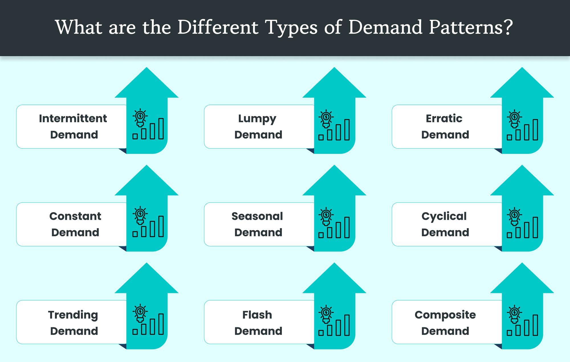
Understanding Seasonal Demand Patterns in Tank Levels
Seasonal demand patterns play a crucial role in shaping the levels within storage tanks, impacting both supply chain management and operational efficiency. Understanding these patterns can unveil insights into inventory requirements and trigger the need for adaptive strategies. Key factors influencing these cycles often include:
- Weather fluctuations: Seasonal extremes can drive up demand for certain products.
- Consumer behavior: Holiday seasons or events can lead to spikes in demand.
- Market trends: Economic cycles may affect purchasing habits and tank usage.
To visualize these trends effectively, companies can utilize graphical data representations, such as line graphs or bar charts. More critically, storing accurate data throughout the year allows for the identification of past patterns. For instance,a simple table showcasing tank levels against the seasonal timeline can highlight significant shifts:
| Month | Average Tank level (%) |
|---|---|
| January | 65 |
| March | 50 |
| July | 80 |
| October | 70 |
By analyzing such data,businesses can forecast future demand levels,ensuring that they maintain optimal tank levels throughout varying seasonal cycles.
Techniques for Effective Visualization of Tank level Trends
To effectively visualize tank level trends, leveraging a combination of graphical representations is key. Line graphs are particularly useful in depicting the continuous changes in tank levels over time,especially during shifting seasonal demands. Pairing these with bar charts can enhance clarity, allowing stakeholders to quickly compare specific time periods or demand surges. Additionally, consider integrating heat maps to illustrate fluctuations in demand intensity, providing a visual cue for critical periods where attention is needed most.
Another vital aspect is utilizing dynamic dashboards that allow real-time data interaction. Incorporating data filters enables users to view trends based on diffrent criteria such as time frames or seasonal demand patterns. This can be complemented by anomaly detection indicators, signaling when tank levels breach predefined thresholds. A practical approach to implementing these techniques involves using tables to summarize critical data while highlighting trends, such as:
| Month | Average Tank Level (%) | seasonal Demand Category |
|---|---|---|
| January | 75 | Low |
| April | 60 | Medium |
| July | 90 | High |
| October | 70 | Peak |
Analyzing Data Correlations Between Seasonality and Consumption
Understanding the relationship between seasonal demand cycles and consumption patterns is pivotal for effective resource management, particularly in industries reliant on tank levels. By analyzing historical data, we can identify recurring trends that signal fluctuations in demand across different times of the year. This data-driven approach allows companies to anticipate spikes or drops in consumption, ensuring that tank levels are optimized to meet consumer needs without falling short or incurring excess costs. Key factors influencing consumption include:
- Weather conditions: Seasonal weather variations can substantially impact consumption rates. For instance, increased demand for heating oil during winter months.
- Holiday seasons: Increased retail activity during the holidays often correlates with higher demand for various consumables.
- Economic cycles: Economic growth or recession can affect consumption patterns,with unexpected downturns leading to reduced tank levels.
To illustrate this correlation, we analyzed tank levels against seasonal demand indicators over the past year.The resulting data allows us to visualize how tank levels responded to different seasonal effects. Below is a table summarizing tank levels in relation to key seasonal peaks:
| Month | Tank Level (in liters) | Demand Spike Indicator |
|---|---|---|
| January | 1200 | High |
| april | 750 | Moderate |
| July | 950 | low |
| December | 1400 | Very High |
The data reveals distinct trends that align with known seasonal demand cycles. Understanding these patterns is critical in devising predictive models that inform supply strategies and inventory management,aligning resources in anticipation of future consumption needs.

Strategies for Optimizing inventory Management Based on Visual Insights
to harness the full potential of visual insights for inventory management, companies should consider implementing several key strategies. By leveraging data visualization tools, organizations can easily identify trends and anomalies in tank levels throughout seasonal demand cycles. This not only enables proactive decision-making but also minimizes the risks associated with overstocking or stockouts. Utilizing dashboards that integrate real-time data can provide managers with an overarching view of tank levels and consumption patterns, ensuring they are always equipped to respond dynamically to changing market conditions.
Additionally, incorporating heat maps and trend graphs can significantly enhance the interpretation of data. These visuals allow stakeholders to quickly assess performance metrics over time, making it easier to pinpoint periods of high demand and adjust inventory accordingly.For instance, using a simple table to display historical data can reinforce the insights drawn from these visuals, helping teams to strategize their responses in advance. Consider the following format for capturing tank level fluctuations against seasonal demands:
| Season | Average Tank Level (%) | Demand Spike (%) |
|---|---|---|
| Winter | 75% | 20% |
| Spring | 60% | 15% |
| Summer | 50% | 25% |
| Fall | 80% | 10% |
In Retrospect
understanding tank level trends through the lens of seasonal demand cycles is not merely an analytical exercise; it is a vital strategy for optimizing resource management and ensuring operational efficiency. By harnessing the power of visualization,we can decode complex data patterns and anticipate fluctuations,thereby equipping businesses with the insights required to navigate the ebbs and flows of demand throughout the year.As we move forward, embracing these visual tools will empower decision-makers to make informed choices, ultimately driving productivity and sustainability. Whether you’re charting the course for inventory management, supply chain logistics, or energy distribution, recognizing and adapting to these seasonal rhythms will continue to be essential in a world that thrives on timely responsiveness and strategic foresight. Remember, in the intricate dance of supply and demand, a clear view of the tank level can illuminate the path ahead.